15 Login Screen Examples for Mobile App Developers
User experience (UX) has always been the element of precedence in a mobile app. A lot of efforts are put in to refine usability of an app and all of it starts with the login screen design.
Designing login screen for a mobile app is a constructive step. At the bare minimum, it includes option for account creation (Sign Up) and login (Sign In). Further, you can add more elements to the login screen like social login, forgot password, view password etc., that perk up the user experience. Here are some of the finest login screen examples to refer and the best practices that can be adopted to offer an easy app entry to the users.
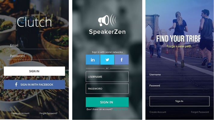
1. Sign Up should be a Task of Few Taps
Sign-ups should be quick. A lot of users get annoyed by filling up a long registration form, which may affect the initial retention rate of the app. Let your users enter the app and then you can garner the information you require to make the user experience better. Here are few tips and examples to master sign-up page design:
- The rule of thumb for UX says ‘More Options, More Problems’. Therefore, make a simple login and sign up page design. Ask them for essentials such as username and password when they are signing up. And once they are introduced with the app, they can fill in rest of the details to access app features and functionalities, accordingly.
- Ditch the demographics: Unless your app relies on age or gender (think fitness trackers or kids’ games), skip these fields for now. Users can easily update them later in their profiles.
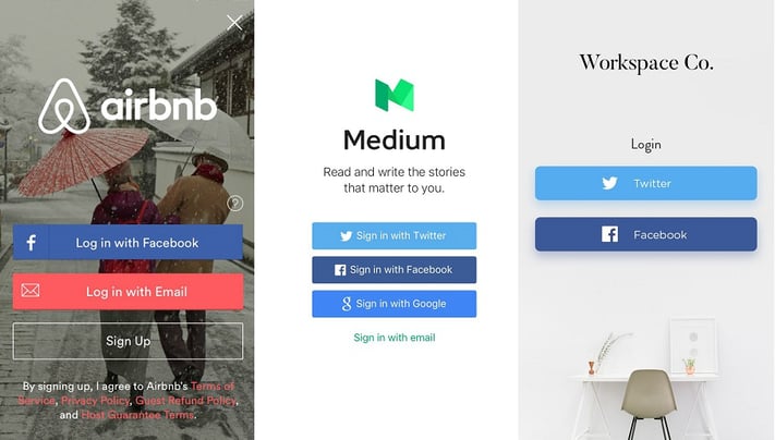
- Social login to the rescue: Always give your users an alternative to email for sign in, like their social media accounts. An average internet user has at least 5 social media accounts. To simplify the process of email validation, allow your users to sign up through their social media accounts.
By streamlining the sign-up process, you pave the way for a user-friendly, welcoming experience that keeps users engaged and coming back for more. Remember, a good login is the first step to a great app.
ALSO READ: How Good UX Design Adds Value to a Business
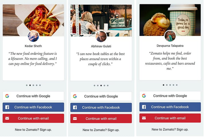
- Before the user sign up for your app, you can give them more confidence about the app potential by displaying the customer reviews. Here is an example of app design.
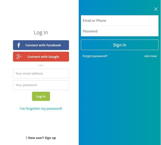
2. Use Email as Alternate to Username
- While a username might seem like a classic login screen element, consider this: complex usernames with random numbers are often forgotten, leading to frustrated users and abandoned accounts. Instead, why not optimize your app design by offering a smooth login experience using email and password?
- Moreover, email boasts a significant security edge over usernames. A username displayed within an app can act as a beacon for those with prying eyes, potentially exposing a user’s account. Conversely, email addresses remain hidden unless explicitly shared, providing an extra layer of privacy for your users. And let’s face it, most people use separate email addresses for public and personal purposes, adding another layer of security for their login credentials.
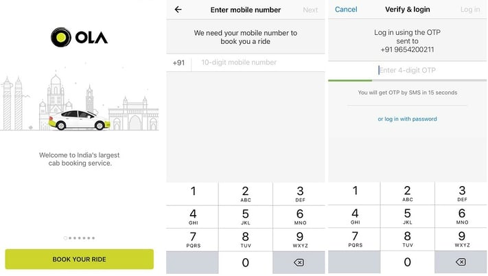
3. Use Mobile Number and OTP to Login
Everyone can relate to the struggle of remembering passwords. To bring your users out of this problem, go for mobile number and OTP for login. Here is an login screen example of how you can execute this app design idea:
4. Offer Option to Login to Another Account
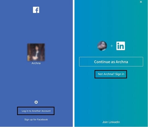
“You can make your app login easier by providing an automated login option, just like Facebook does (one-tap login or with a 4-digit passcode). Then, give users the option to log in to another account as well.”
5. Facilitate Password Resetting on Login Screen
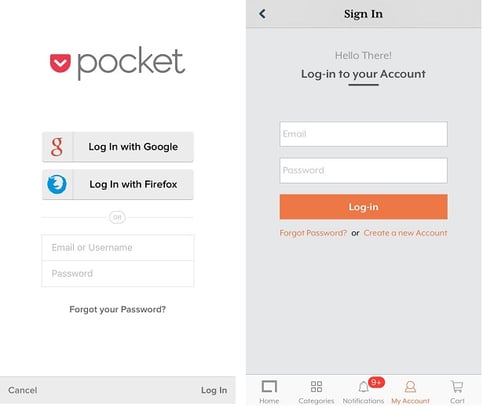
From unlocking your smartphone to securing multiple accounts, we use and remember a number of password. Therefore, it’s quite obvious to consider that if a user signs into an account after a long time, they might not remember the password. So, give your users an option to reset the password, right there, on the sign-in screen.
Here’s an example of a login page design-
6. Inform your Users about what you Do
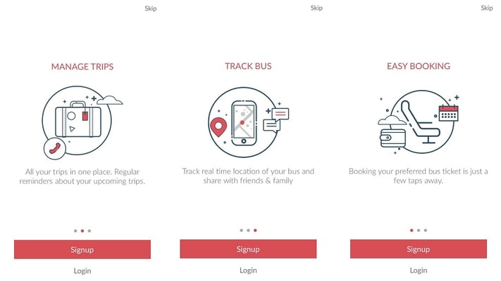
You can use this idea of login screen design if your app is new and you wish to give them an idea about your business model or your app. Here’s how you can implement this through the app design example below:
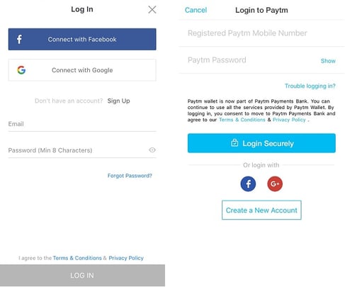
7. Allow Users to View Password in Login Screen
Generally, passwords are a combination of alphabets, numbers, and special characters. While entering passwords to sign-in, possibility is that your users enter a wrong password and thus he has to give one more try to the login process. To escape this problem, give users an option to view the password, before they sign in.
Take a look at the app designs of Facebook and Paytm, where they provide this option to their users:
8. Use Biometric Authentication for Quick Access
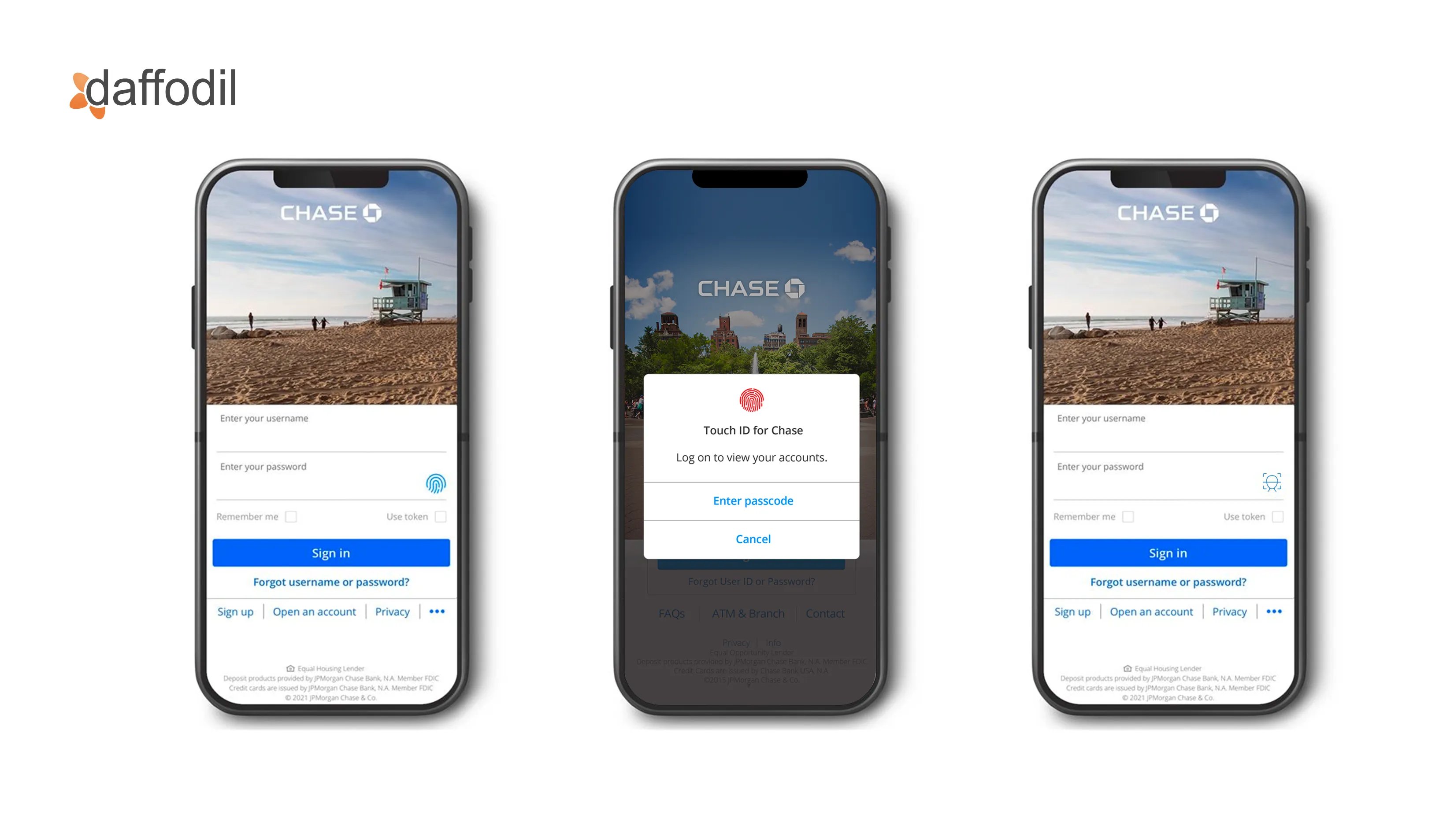
Skip the simple login design; instead, implement biometric authentication, such as fingerprint or facial recognition on the login page screen. It provides a sleek and secure approach to designing your app’s login page. This method is particularly popular in banking and finance apps, where security is essential. For instance, mobile banking apps like Chase or Bank of America often allow users to log in using their fingerprint or face ID, combining convenience with enhanced security.
9. Implement Localized Language Options
For global apps, offering language options directly on the login screen is essential for inclusivity. Messaging apps like WhatsApp exemplify this by providing users with the ability to choose their preferred language right from the login screen. So, no more struggling with form fields in a foreign language, just a good login experience in just a click.
Implement this idea in your app design, ensuring that your users from diverse linguistic backgrounds can easily navigate the app in a language they are comfortable with.
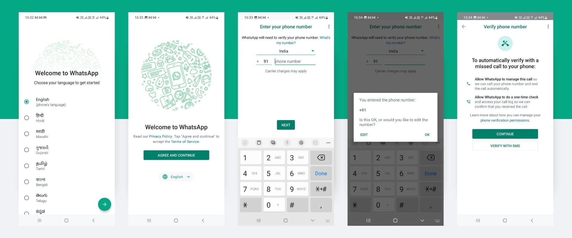
Image source: Superblog
10. Offer QR Code Login for Quick Onboarding
Simplify onboarding with QR code login, where users can scan a code to access their accounts. This method is employed by apps like WhatsApp Web, which allows users to scan a QR code on their computer using their mobile app for a quick and secure login.
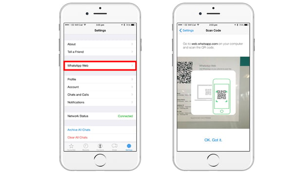
Image source: Smartprix
11. Gamified Login Experience
Make the login process engaging by gamifying it. Incorporate interactive elements, challenges, or rewards during the login process. Look at the app design of Duolingo, a language-learning app, that uses gamification techniques to make the onboarding process more enjoyable and motivating for users.
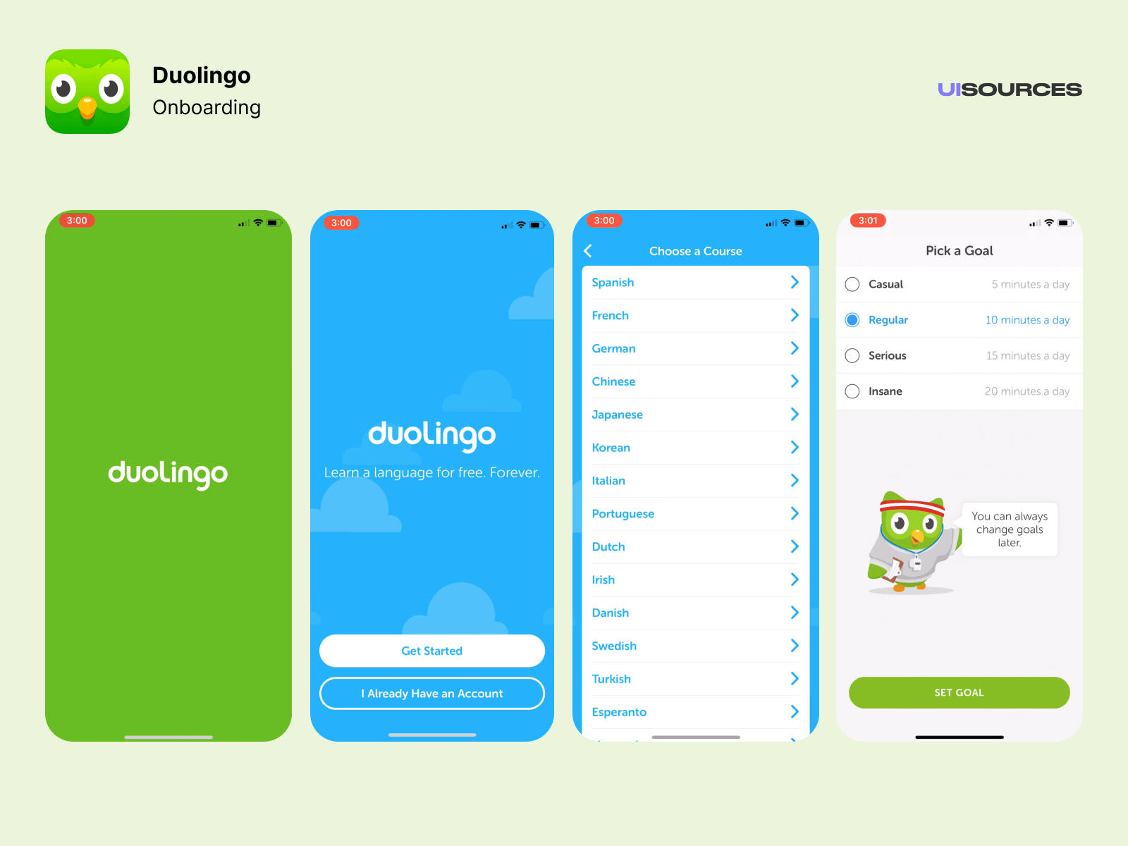
Image source: UIsources
ALSO READ: Best UX Design Practices for A Mobile App Walkthrough
12. Provide Guest Login for Quick Exploration
Introducing a guest login option is particularly useful for apps with intricate features where users might want to explore the app before committing to a full sign-up. Video streaming services like Netflix implemented this strategy, enabling users to browse content and understand the app’s functionality before deciding to create an account. This approach reduces barriers to entry and encourages user engagement.

Image source: TheLoginSupport
Another engaging example of a login screen is found on Amazon. While it doesn’t provide a traditional guest login, it allows users to browse products without requiring an account. However, to make a purchase, an account is necessary.
13. Utilize Customizable Themes for Personalization
Allowing users to customize the login screen with themes or personalized elements enhances the overall user experience. Social media giants such as Microsoft and Google have implemented this feature, allowing users to tailor the login page by selecting themes, background colors, or even uploading their brand logo as a profile background for a more personalized touch. This customization contributes to a more engaging and visually appealing login environment.
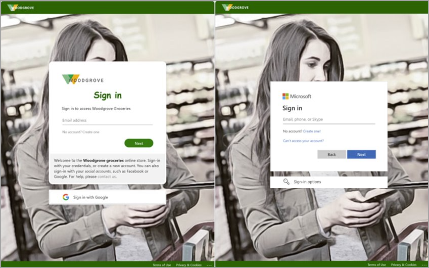
Image source: MicrosoftLearn
What’s the Best Login Screen Idea for your App?
As we wrap up our exploration of these login screen examples, it’s clear that the initial interaction users have with a mobile app is crucial. These examples showcase the diverse ways in which developers can make a strong first impression, ranging from sleek and simple designs to engaging animations.
Remember, a well-designed login screen not only enhances user experience but also sets the tone for the entire app journey. Drawing inspiration from the creativity displayed in these examples, consider how you can incorporate elements that resonate with your app’s identity.
Not sure where to start? Look no further. As a leading mobile app development company, we’re here to guide you in coding a standout login screen. Our team of experts is ready to turn your ideas into reality, ensuring your app makes a lasting first impression.


